How to read the jobs report and what it means for your search
What the monthly US and UK labour statistics actually measure, which figures matter to a job seeker, how to use them to target a search, and common misreadings.
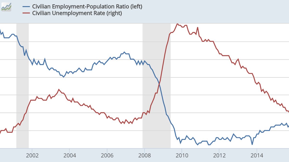
On the first Friday of most months, a set of numbers drops from the US Bureau of Labor Statistics and, for a few hours, everyone from the Federal Reserve to your uncle has a view on it. Markets move, headlines declare the labor market “hot” or “cooling,” and a job seeker reading over breakfast is left with a vague sense that the news is good or bad for them without knowing why. In the UK the equivalent release from the Office for National Statistics gets less fanfare but the same treatment.
The jobs report is genuinely useful to someone looking for work, but not in the way it is usually reported. The headline number tells you almost nothing about your own prospects. Three or four figures buried further down tell you quite a lot. This guide explains what the reports measure, which parts matter to a person rather than a bond trader, how to use them to target and time a search, and the misreadings that lead people to bad decisions.
The US report: two surveys, one headline
The BLS Employment Situation report combines two separate surveys that are often confused.
The establishment survey (also called the payroll survey) asks a large sample of employers how many people were on their payrolls. It produces the headline “jobs added” figure, the breakdown by industry, average hourly earnings and average weekly hours. It is large and reliable for the total but subject to revision: the first estimate for a month is revised in each of the next two reports, and once a year the whole series is benchmarked against more complete tax records. Revisions can be large, and it is normal for a month that was reported as strong to end up modest after revision, or the reverse.
The household survey asks a smaller sample of households whether people are working, looking for work, or neither. It produces the unemployment rate, the labor force participation rate, and the broader measures of underemployment. Because the sample is smaller, its monthly figures are noisier, and the two surveys can point in different directions in any given month.
Both are seasonally adjusted, meaning statisticians strip out the predictable swings (retail hiring before the holidays, construction slowing in winter, teachers leaving payrolls in summer). The adjustment is good but not perfect, and unusual weather or a holiday falling in a different survey week can distort a single month.
The practical consequence: never draw a conclusion from one month. Look at the three-month average of payroll gains and the direction of the unemployment rate over a quarter or two. The BLS itself says roughly this in every release, and almost nobody reads that part.
The UK release: payrolls, a troubled survey, and vacancies
The ONS labour market release is monthly and combines several sources.
Payrolled employees come from HMRC’s PAYE Real Time Information system, which counts people actually on payroll. This has become the most reliable headline series, though it also gets revised.
The Labour Force Survey provides the unemployment rate, employment rate and economic inactivity. It has had well-publicized problems in recent years, with falling response rates leading the ONS to suspend and then reintroduce parts of it with caveats. A transformed survey is being phased in. Until that settles, treat the UK unemployment rate as an indication of direction rather than a precise figure, and pay more attention to the payroll and vacancy data.
Vacancies are estimated from a survey of employers and published as a three-month rolling figure. This is the UK series most useful to a job seeker, because it measures demand directly. The fall from the 2022 peak, and whether it has stabilised, is the single most relevant trend for anyone applying for jobs there.
Average earnings are given as regular pay (excluding bonuses) and total pay, in both cash and real (inflation-adjusted) terms. Regular real pay growth is the figure to watch if you are trying to work out whether your salary expectations are keeping up.
Statistics Canada and the Australian Bureau of Statistics publish comparable monthly labour force releases. The same cautions apply: watch trends, not months.
The numbers that actually matter to a job seeker
The headline jobs figure and the unemployment rate are national averages across every industry, region and skill level. Your search happens in one industry, one region and one skill level. Here is what to read instead.
Industry-level payroll changes. The US establishment survey breaks employment down into sectors and subsectors: healthcare, construction, professional and business services, retail, leisure and hospitality, information, manufacturing, government and so on. A month where the economy adds a healthy number of jobs but almost all of them are in healthcare and government tells a software developer or a marketing manager something quite different from what the headline says. Find your sector’s line and look at its trend over six months.
Job openings, hires and quits. The BLS publishes a separate monthly release, the Job Openings and Labor Turnover Survey, usually referred to as JOLTS. It lags the main report by about a month but it is far more useful for a job seeker. Openings tell you how much unfilled demand exists. The hires rate tells you whether those openings are actually being filled or are sitting stale. The quits rate is the best single measure of worker confidence: people quit when they believe they can get another job. When quits fall and openings fall together, employers have more bargaining power and you should expect longer searches and less room to negotiate. When quits rise, the reverse. The ratio of openings to unemployed people is a rough measure of how competitive the market is overall.
Weekly initial claims for unemployment insurance. Released every Thursday by the Department of Labor. Rising claims are an early warning of layoffs; the four-week average is the number to watch because the weekly figure jumps around. Continuing claims (people still receiving benefits) rising while initial claims stay flat suggests that people who lose jobs are taking longer to find new ones, which is directly relevant to how long you should budget for a search.
Average hourly earnings and real pay growth. These tell you whether wages are outpacing inflation. If real pay is rising in your sector, employers are competing for people and you have room to negotiate. If it is flat or falling, the pressure runs the other way, and a salary expectation built on last year’s market may be out of date. The method for turning this into a personal benchmark is at /pay/how-to-check-if-you-are-being-underpaid/.
Long-term unemployment and the broader underemployment measure. The BLS publishes the share of unemployed people who have been out of work 27 weeks or more, and a broader rate (often referred to as U-6) that includes people working part-time because they cannot find full-time work and those who have stopped looking. When these rise while the headline rate stays low, the market is weaker than it looks, and the people it is weak for are those without a job in hand.
Regional and state data. Both the BLS and the ONS publish regional breakdowns, though with a lag. If you can move, or are choosing between two cities, the regional unemployment rate and the regional vacancy trend are worth ten minutes of your time.
How to use the numbers to target a search
The reports will not tell you where to apply. They will tell you which way the wind is blowing, and that should change three things about how you search.
How many applications and how much patience. In a market where openings are falling and continuing claims are rising, a search that took six weeks two years ago may take four months now. Plan your money, your expectations and your family conversations around the market you are in, not the one you remember. If you need income quickly, the realistic short-term plan at /job-search/how-to-find-a-job-fast-when-you-need-money-now/ is built for exactly this situation.
Which sectors to aim at. If your skills transfer across industries (most do more than people think: project coordination, sales, finance, operations, HR, customer-facing roles), point your search at the sectors that are adding jobs. Someone with an operations background who applied only to technology companies in a period when technology payrolls were flat, while healthcare and logistics were hiring steadily, was making the search harder than it needed to be. Read the sector table with that question in mind.
How hard to negotiate. A high quits rate and rising real pay in your sector are evidence you can bring to a negotiation. A low quits rate is a reason to take a solid offer rather than hold out for a perfect one.
There is a limited timing benefit too. Hiring has seasonal patterns that the reports confirm: activity typically picks up early in the calendar year and again in early autumn, and slows around major holidays and in late summer. If you have flexibility about when to start looking, the reports will not change that pattern, but they will tell you whether the seasonal upswing arrived or was muted.
Common misreadings
Treating the headline as your forecast. A strong national jobs month with a weak month in your sector is a weak month for you. The reverse is also true, and more cheerful.
Reacting to a single month. One month’s figure is an estimate with a margin of error large enough to swing the sign. The revisions two months later often tell a different story. Use three-month averages.
Reading a falling unemployment rate as good news without checking why. The rate falls when people find jobs. It also falls when people stop looking and drop out of the labor force. If the participation rate is falling too, the “improvement” is partly people giving up.
Confusing the two US surveys. “Jobs added” comes from employers; the unemployment rate comes from households. They can disagree, and when they do, the payroll figure is usually the more reliable one for the month, while the household survey is better at catching turning points over longer periods.
Ignoring revisions. A month reported as strong and then revised down sharply was, in reality, a weak month. If you are reading the report as a guide to the market, read the revisions to the previous two months as carefully as the new figure.
Assuming the UK unemployment rate is precise. Given the survey problems, it is not, at least for now. Use payrolled employees and vacancies.
A ten-minute monthly routine
You do not need to become an economist. Once a month, do this.
- Open the release (the BLS Employment Situation or the ONS labour market overview; both are free and the summary pages are readable).
- Note the three-month average for payroll growth (US) or the payrolled employee trend (UK), and the direction of the unemployment rate. Do not react to the single month.
- Find your sector in the industry table and note whether it added or lost jobs over the past quarter.
- Check the latest JOLTS quits rate (US) or vacancy trend (UK). Rising means more bargaining power for you; falling means less.
- Glance at the four-week average of initial claims, and at continuing claims. Rising continuing claims means longer searches.
- Write down one sentence about what this means for your search this month: “Sector flat, quits low, plan for a longer search and widen to adjacent industries,” or “Sector hiring, real pay up, hold out for the right offer.”
That sentence is the whole point. The report exists to move markets and inform central banks; for you, it is a monthly reality check that keeps your expectations, your application volume and your negotiating posture matched to the market you are actually in. Most job seekers never look. The ones who do tend to spend less time being surprised.
This article is general information, not legal, financial or medical advice. Rules differ by country, state and employer; check the current position for your situation. See our editorial policy and disclaimer. Spotted an error? Tell us.